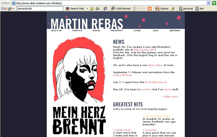
Williams and Tollet's (2000) four principles were used to review the following personal website.
- Alignment:
The site consistently follows the alignment rule. Everything is justified to the left.
- Proximity
The juxtaposition of items within the page is done in a way that is comfortable and logical to the reader.
- Repetition
Rebas' site has characteristics within each page that are consistent. It is clear that pages within the site are part of an entire site.
- Contrast
There is eye-catching information on the front page. It brings attention to the site. However, the information on inner pages contains only a persistent navigation bar that brings contrast to the pages. It's a weak negative, but the only noteworthy negative element of the site.
The site contains a number of dos and don'ts.
- Dos
- Background does not interrupt text
- Text is big enough...
- The hierarchy of information is perfectly clear
- The columns of text are narrower than in a book...
- Navigation is easy to use
- The navigation bar [is persistent]...
- Links are underlined...
- Link colors coordinate...
- Page downloads quickly
- ...640 x 460 [screen size]
- Every web page in the site looks like it belongs to the same site...
- Don'ts
n/a