Using Williams and Tollet's (2000) principles, a lyric page was investigated.
- Alignment:
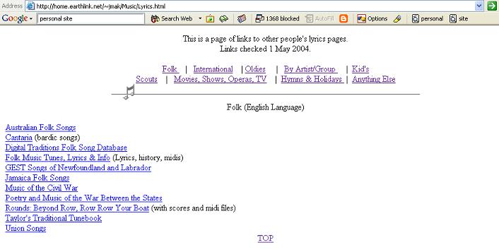
The page has text at the top of the page that is centered, while the material toward the bottom is left-justified. This poses a layout issue for the reader.
- Proximity
There is close proximity between the page's navigation and the title of the page. Thus, the reader may interpret the navigation as part of the title, or the title a reference to the navigation.
- Repetition
The entire site has no distinguishing characteristics that make it part of a greater whole. The opening main page has no graphic and no large title. All the subsequent pages are the same. It makes the site exist as a fractured set of disjoint pages.
- Contrast
There is no eye-catching material. There is no graphic or title that makes the page noteworthy or special. It's uncertain what the topic is as a result.
The site contains a number of dos and don'ts.
- Dos
- Text is big enough...
- Navigation is easy to use
- Links are underlined...
- Page downloads quickly
- Don'ts
- Centered type over flush left body copy
- Default blue links
- Missing graphics...
- No focal point
- No contrast